

Vela App
UX Case Study – weather app for sailors
Vela is a conceptual weather app designed specifically for beginner sailors, helping them navigate safely with easy-to-understand forecasts and educational features.
My Role
Solo student project for UX CareerFoundry bootcamp
Tools
Figma, Google forms, Optimal Sort, Adobe Photoshop

Duration
Jun 2022 - Jun 2023

The Process
Empathize
Problem Statement
Sailing beginners need a way to easily and intuitively take in the information about the weather according to their sailing preferences because they want to safely and successfully complete their journey. They also need to easily find information on the main sailing topics to keep up with their studies.
We will know this to be true when we see an increase in the number of users in our app.
Competitive Analysis
Two competitors were analysed, Windy.app and Windfinder. SWOT profiles were made of the two apps.
Windy.app
Strengths
has consolidated in the market as a competitive app
has a clean and modern design style
has received an award from a recognized institution as the best-specialized weather app in its category
Weaknesses
requires payment from users to access all the tools
not so friendly for users who are not so used to the meteorological vocabulary. It does not offer so many types of personification.
Opportunities
create a version of the app for people who are just starting to learn about water activities
find other forms of revenue to unlock as many free tools in the app as possible
Threats
Many users might prefer apps in which no payment is required.

Windfinder
Strengths
has consolidated its space in the market
offers many of its tools for free on both the mobile and desktop platform
Weaknesses
requires payment for some of their tools in the app
presents some design problems in their interface
Opportunities
UX Design could be improved
price for the monthly or yearly contribution is not available unless the user goes through with the 7 days trial
Threats
Many users might prefer apps in which no payment is required and which present a better UX Design.

User Interviews | Guerrilla Interviews
Interview details
5 Participants
from 2 countries
from 23 to 57 years old
all had similar levels of sailing knowledge
Insights
participants didn’t use the map section of the app, they would prefer to see the forecast on the report tables.
many find it difficult to remember what everything means, there are many new terms
many find their current app too clustered with information
they feel often stressed when using their current apps, either because of sailing or because of their app

Affinity Mapping | Negative Feelings
The project was originally targeting experienced sailors. However, after the first round of User Interviews, many participants showed to be very satisfied with their current weather forecast apps. The insights from the interviews demonstrated that there were only small improvements that could be made to the already existent apps. Therefore, the target of the project was changed to sailing beginners. A second round of interviews, this time Guerrilla interviews, took place in sailing clubs along the body of water called Alster, in Hamburg, Germany. There, I found many people who were learning how to sail, they were each asked 15 questions.
First Challenge
“I'm pretty happy with my current app […] I wouldn't want to change it.”
- Sebastian, experienced sailor from the 1º round of interviews
Define
Personas
Personas were based on all the information that was gathered so far in the project, they were created to represent our potential users and to drive our efforts to better understand our users’ needs.


User Journeys
User Journeys are relevant to understand and analyse the scenario that the personas are in while they complete certain actions. Based in all the information gathered so far, it was then presumed how they could be feeling and thinking.


User Flow & Task Analysis
In this part, we start to see how the personas would be interacting with Vela based on the Tasks that they would like to complete.


Insights
revising my interview notes and audio recordings was essential to create more realistic Personas and User Journeys
it is challenging to imagine how the personas could be feeling at every step of their task
Ideate
Sitemap
That is when the Vela app starts to take shape! Through Card Sorting and the Similarity Matrix, we could determine what would be the most intuitive way of grouping the sections of Vela to then develop the Sitemap.


Second Challenge
The dislike of the interview participants towards the map section of their applications was at first interpreted as if they just preferred the other functions of the app. Therefore, at this stage in the project, the other sections of the app were in focus and the map section had been discarded. However, to be sure of the intent of the participants, a survey was done and from this survey, 2 participants were further interviewed about their preferences for their apps. Below you’ll find the results of this research and some insights.
“I never use the map here (app), it’s so confusing…”
- Michael, sailing beginner from the Guerrilla Interviews


Insights
2 of the 3 Survey participants that answer no to using the weather map were interviewed. The main goal of the interview was to better understand the reason why they did not use the map.
the colors and amount of information on the map have a big impact on how the users react to this feature.
they often do not know what the icons mean.
they would use the map only for a couple of reports; therefore, they do not need much information.
Prototype
Wireframing
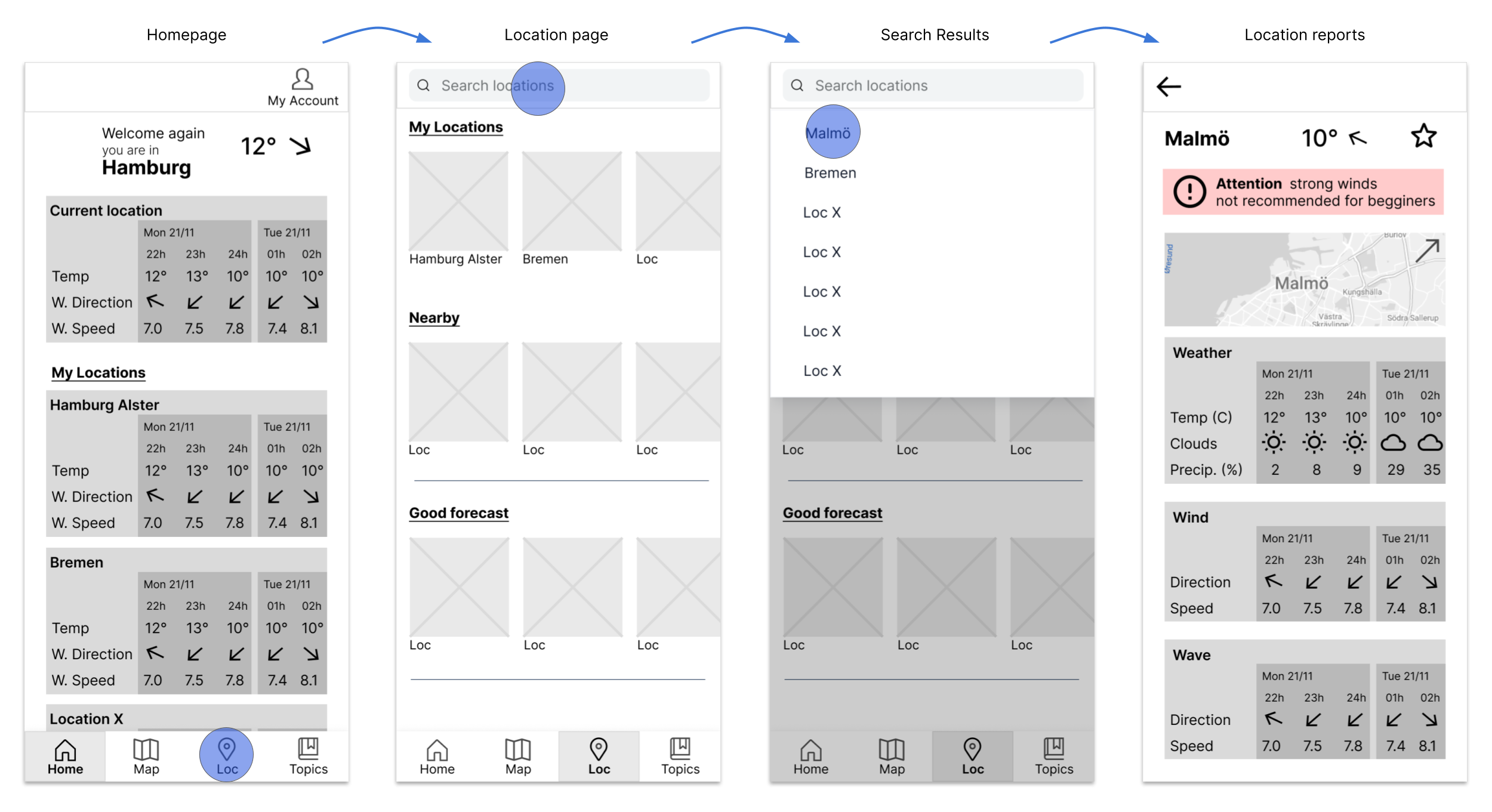
After the Sitemap, many sketches were created, and finally, the first low-fidelity prototype was made with a pen and paper. At this point in the project, the research about the map was still in progress so the map section was not a part of the application at this point. The flow below shows the task of accessing the Location Reports through searching a location on the location page.

Lo-fi Prototype
Mid-fi Prototype
Test
Usability Testing
It was finally time to see how potential users would interact with Vela. Tests took place both in person and online, its results were analysed through Affinity Mapping and Rainbow Spreadsheet.
Test details
6 Participants
from 2 countries
5 online tests and 1 in-person
from 23 to 54 years old
5 participants are sailing beginners and 1 is interested in weather reports because of another hobby
Rainbow Spreadsheet

Affinity Map

Test Objectives
Determine possible points of friction on the navigation of the app
Observe and analyze how users interpret the visual cues and text in Vela
Understand how the users feel while they complete the tasks
Key Findings
participants had trouble understanding whether to find the locations on the Map or the Locations page
some were unsure about the purpose of the Topics page (Learn page)
3 of them had problems understanding the buttons/functions of the Map page
some seem confused by the Locations page and the Topics page looking so similar
Design Iterations
Many iterations were made after the Usability Testing. After that, a Preference Test was also conducted to test different versions of a solution for the same problem, there were 9 participants. Iterations were also made based on Gestalt Principles, accessibility guidelines, and on feedback received by peers from the course.
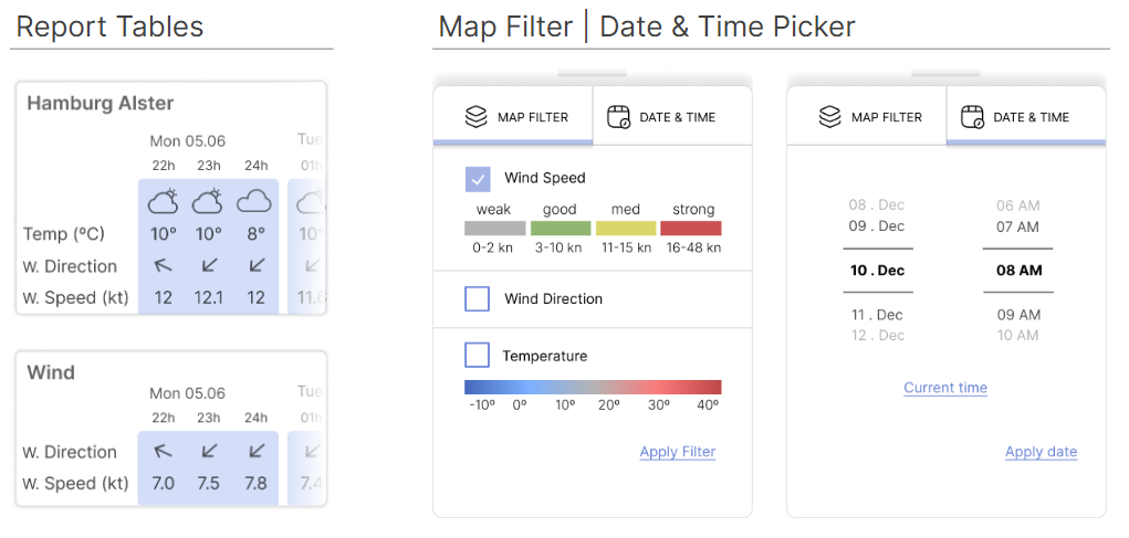
Map Page
Usability Testing participants seemed confused when using the map and its filters, they didn’t like the fact that the wind speed scale was always present and that it would disappear once the Map Filter was selected.
After many iterations, the latest version was created, which allows users to have full visibility of the map when wanted.

Quotes from Usability Tests

Implement
Design Language System
The Design language System was then created, maintaining consistency throughout the app.

Color Palette
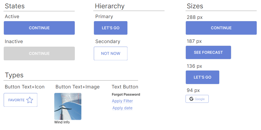
Buttons
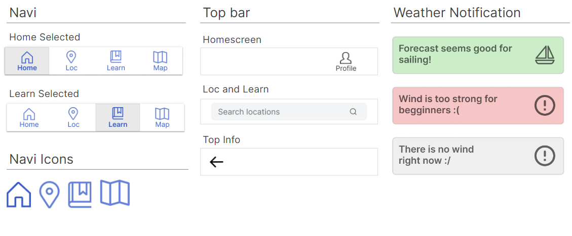
UI Elements
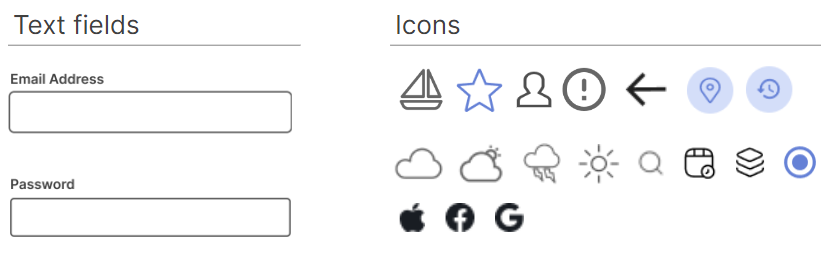
Logo

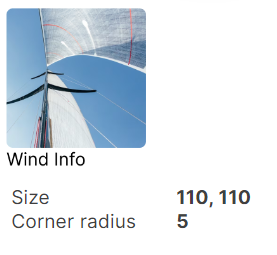
Image Button
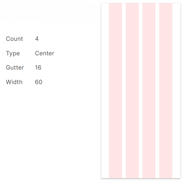
Grid
Typography

Final Version
The Vela App provides sailing beginners with precise weather forecast reports and allows them to study the main sailing topics. Users get notifications when the weather is adequate for sailing beginners or when it is becoming more dangerous. With the application, they can easily analyse wind maps and start their journey into the sailing world!
You can access my latest prototype here.

Conclusion
Developing a weather forecast app was very challenging for someone who does not have contact with the hobby of sailing. Nevertheless, after much research and iteration, I believe to have created value design solutions that will provide the user with a positive experience. This project taught me to research more in-depth to understand and empathize with what the users are going through. I also learned to let go of ideas and concepts that are not leading to an effective solution and to be open to new paths that my projects may take at times. The Guerrilla Interviews and Usability Tests brought many perspectives about the user experience and it lead me to a creative process to develop Vela. I would love to continue testing the application to bring as many improvements as possible. The final result, however, allows users to not only easily access their weather information but also to study this new hobby.
Working on this project was an enriching opportunity that brought me even closer to my desire of being a UX Designer, I am truthfully thankful to my Mentor and Tutor in this project as they had helped so much every step of the way.
