


Botanik Branding
Visual identity and packaging design for a natural soap brand
Botanik Naturals is a fictional soap label developed as a compact branding case study. Inspired by Etsy trends and small-batch aesthetics, the project explores how a handcrafted brand can look professional, cohesive, and scalable. My goal was to build a visual identity that feels natural, trustworthy, and ready for seasonal storytelling.
Tools
Infinite Painter, Photoshop, Canva, eRank, Marmalead, EverBee
Duration
May – June 2025
Design Process
I started by researching design trends on Etsy using eRank, Marmalead and Everbee, then created a mood board with colors, textures, and visual cues from nature. I sketched logo ideas digitally, explored multiple alternatives, and refined the final design around a structured arch and soft floral motif. From there, I defined a color palette, selected typography, and applied the branding across packaging and digital content.


Logo Deliverables
Primary Logo – For packaging, website headers, and print materials
Vertical Version – Compact option for stamps, inserts, or vertical layouts
Wordmark – For minimalist uses like invoices, hangtags, or social media
Monogram/Icon – Ideal for stickers, profile pictures, and small formats
Core Elements:
The logo combines structure and softness: the arch symbolizes stability and reliability — a sign of quality. The flower adds an organic touch that highlights the natural character of the brand.

Typography & Color Palette
Colors:
#f0eadc– evokes natural materials & handmade products#868460– a calm, grounded mix of warm & cool tones#314335– represents growth & botanical purity#0e0022– adds depth, elegance, and contrast
Typography:
Bookmania – classic serif font for logo & headlines – stands for craftsmanship & timelessness.
Inter – modern, geometric sans-serif for body text & subtitles – used also in all caps with generous tracking for clarity and lightness.

Core Collection
The main line was designed in a 9×2 inch format – optimized for small batches and handcrafted packaging. Three subtle color tones reflect the natural aesthetic and clean branding of Botanik.

Garden Ash
Sage, Lavender & Vetiver
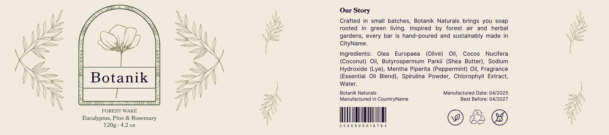
Forest Wake
Eucalyptus, Pine & Rosemary
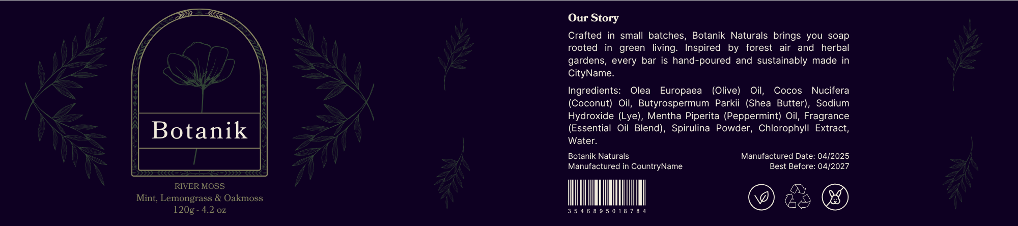
River Moss
Mint, Lemongrass & Oakmoss
Instagram-Carousel
A 5-part Instagram post introduces the brand, design elements, and seasonal variants. The simulation demonstrates how Botanik Naturals could launch with a cohesive and visually strong social media presence.

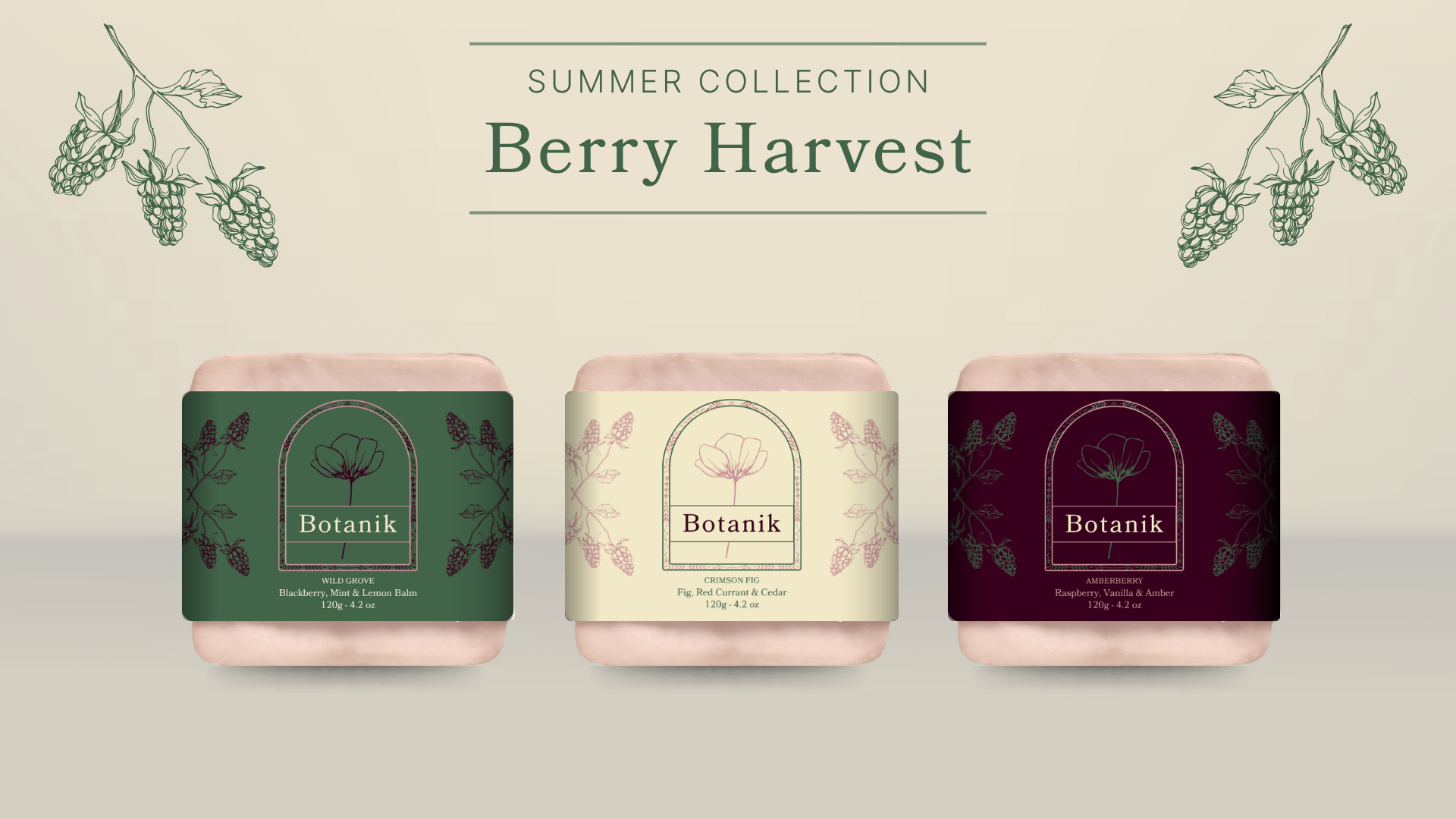
Seasonal Collections
Soft Bloom – Spring Collection
Delicate pastel tones reflect early blossoms and cool morning air. Illustrations and floral-herbal scents create a gentle start to the season.
Berry Harvest – Summer Collection
Forest green, cream, and deep berry red embody the richness of summer: ripe berries, herbs, and sunshine. The palette conveys warmth and naturalness while maintaining the handmade character.

This project allowed me to explore branding from concept to execution — with a focus on visual cohesion, market trends, and product storytelling. Through Botanik, I learned how small details in packaging, color, and typography can help express a brand’s values and connect with its audience.
